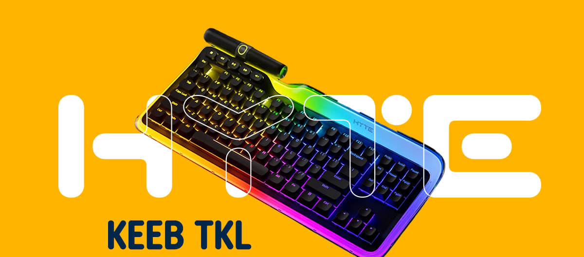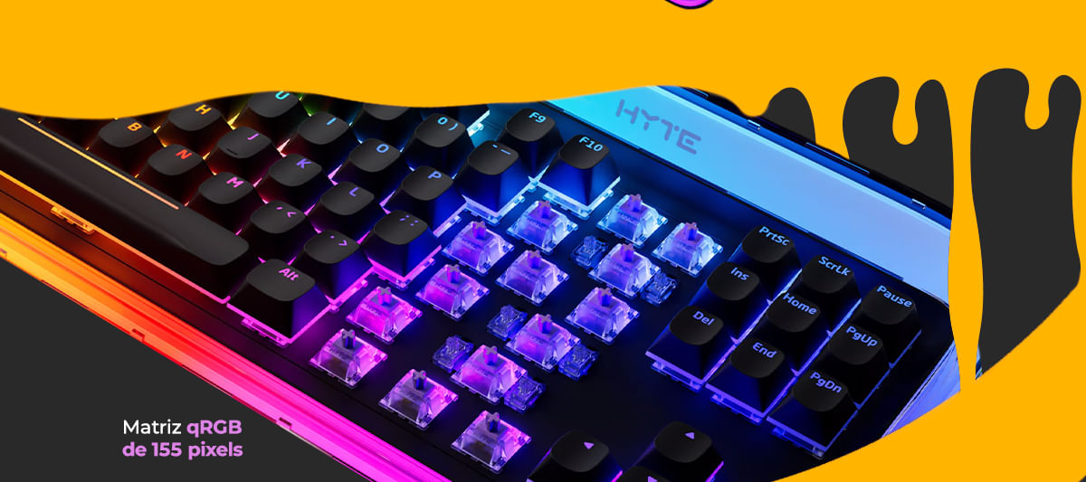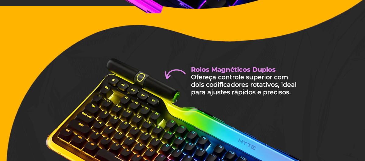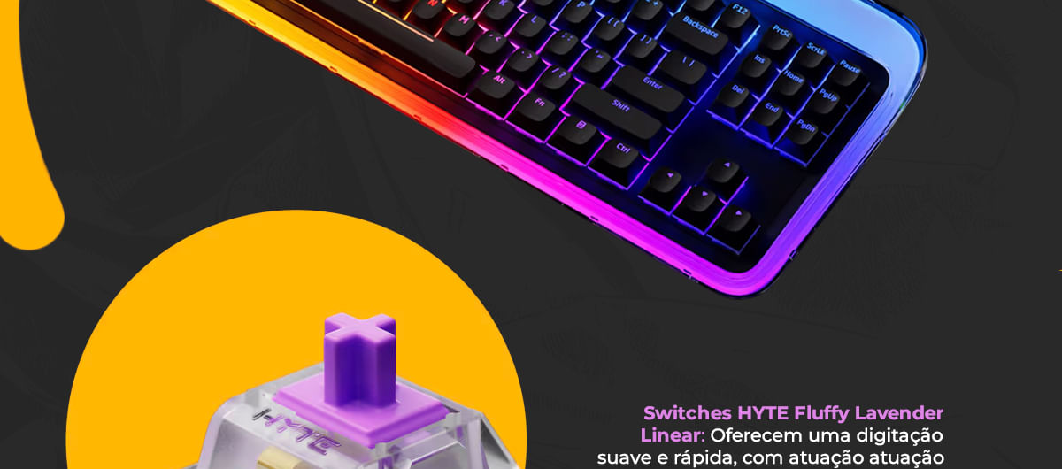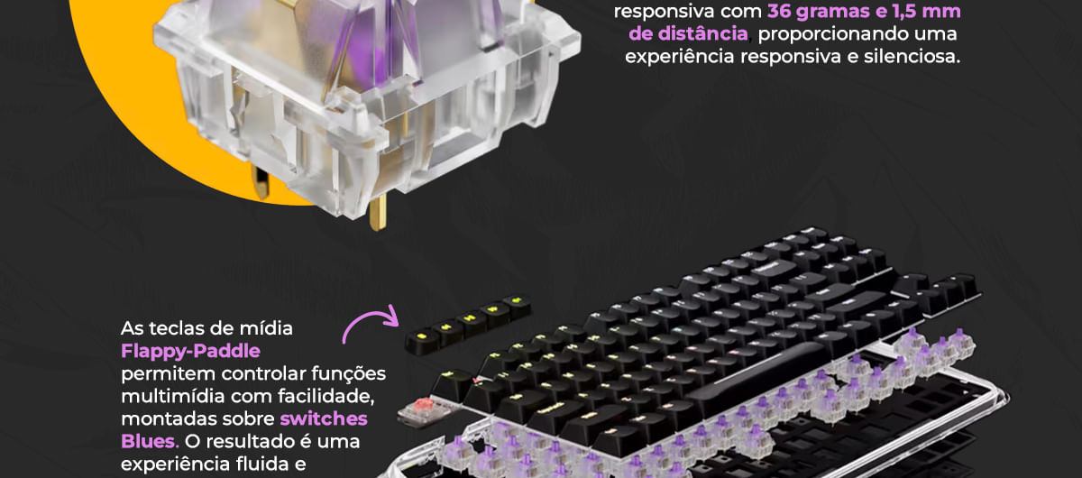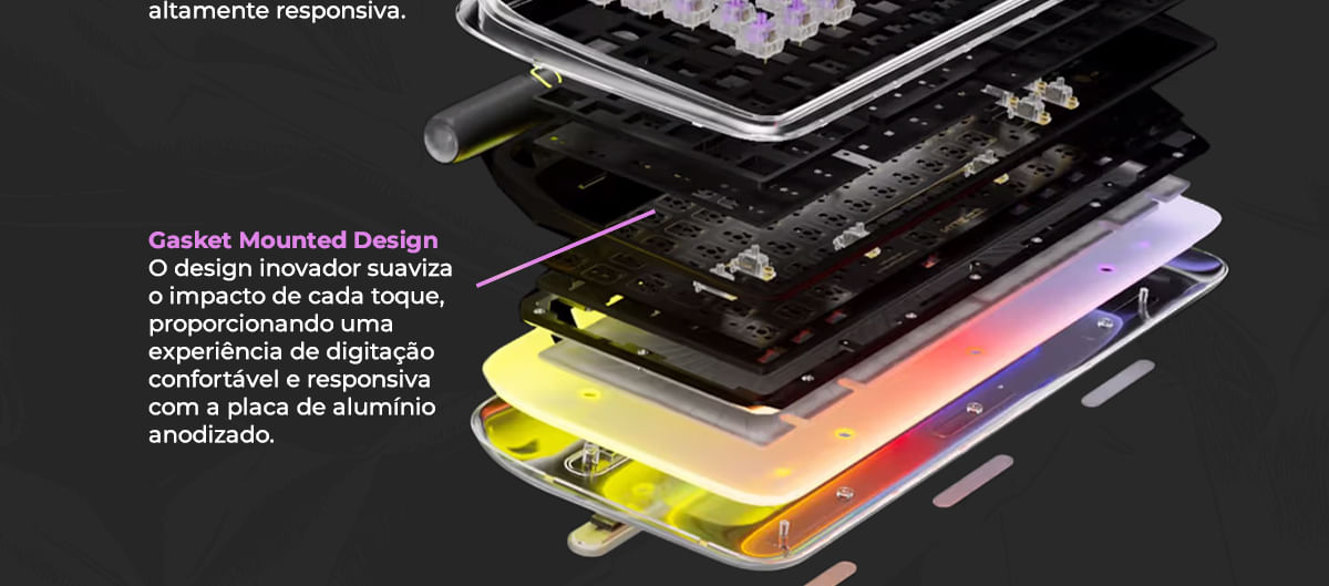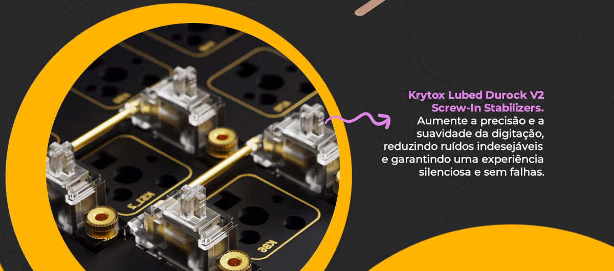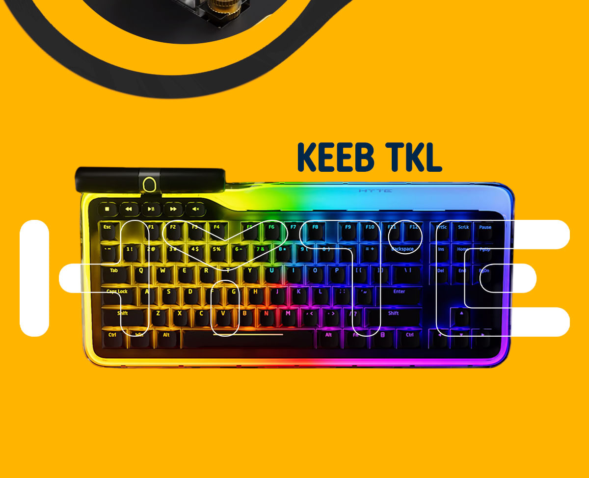

Teclado Gamer Hyte Keeb TKL, 93 Keys, Retro iluminação QRGB, USB 2.0, Tipo C, KB-HYTE-KEEB
Shopinfo Lomadee
De R$ 2.645,20
R$ 1.888,77
-29% off
Ganhe R$ 18,89 de volta + 188,88 BigPoints de brinde!
Entrar para Comprar e Ganhar Cashback section[class*="container"] { position: relative; display: flex; align-items: center; justify-content: center; } section[class*="container"] img { display: block; width: 100%; } section[class*="container"] .content { position: absolute; display: flex; flex-direction: column; gap: 15px; font-size: 23px; line-height: 22px; max-width: 1300px; } section[class*="container"] .content p { font-weight: 700; font-size: 23px; line-height: 24px; } section.container-1 .content { bottom: 13%; right: 10%; text-align: start; max-width: 500px; } section.container-1 .content .org-info { display: flex; justify-content: center; align-items: center; margin-top: 1em; } section.container-2 .content { bottom: 5%; right: auto; text-align: center; color: #ffffff; } section.container-3 .content { bottom: 79%; right: auto; text-align: center; color: #fff; } section .content-img { position: absolute; display: flex; flex-direction: column; align-items: center; justify-content: center; } section .content-img img { width: 70%; } section img[alt="dpi"] { width: 75%; } section img[alt="rgb"] { width: 25%; margin-left: 1em; } section .content-img img[alt="logo1"] { width: 50%; margin-bottom: 2.5em; } section .content-img img[alt="teclados"] { width: 90%; margin-bottom: 10.5em; } .container-1-1 { height: 30vh; background-color: #090909; color: #fff; } .container-1-1 div p { margin-top: 0.5em; } .container-2-2 { height: 50vh; background: #fff; color: #3d3d3d; } .container-1-1 .content-1-1 { display: flex; flex-direction: initial; gap: 60px; font-size: 17px; bottom: 40%; text-align: center; font-weight: 900; position: relative; } .container-2-2 .content-2-2 { display: flex; align-items: center; } .container-2-2 .content-2-2 p { font-size: 22pt; font-weight: 900; margin-bottom: 1em; } .container-2-2 .content-2-2 span { font-size: 15pt; font-weight: 900; } .content-5-5 { color: #fff; position: absolute; display: flex; justify-content: center; width: 80%; margin: 0 auto; top: 75px; } .content-5-5 img { width: 20% !important; } .content-5-5 img[alt="Neologic"] { width: 55% !important; margin-bottom: 1em; } .content-5-5 img[alt="download"] { width: 15% !important; margin-bottom: 0em; } .content-5-5 .content-info, .content-info-2 { max-width: 900px; margin-left: 3em; } .content-info-2 { display: flex; flex-direction: column; justify-content: center; align-items: center; } .content-info-2 div { display: flex; align-items: center; } .content-5-5 p { font-size: 22pt; font-weight: 900; } .content-5-5 span { font-size: 11pt; font-weight: 900; width: 175px; margin-left: 0.5em; } section .mouse { display: flex; justify-content: center; } section img[alt="sensor"] { width: 70%; margin-bottom: 1em; } section img[alt="mouse"] { width: 88%; margin-bottom: 1em; position: relative; top: 4em; z-index: 2; } section .content-img-2 { position: absolute; display: flex; align-items: center; justify-content: space-between; display: grid; grid-template-columns: 1fr 1fr; left: -5px; } section .content-img-2 img[alt="presion"] { width: 90%; } section .vemjogar { width: 84% !important; position: relative; top: 5em; left: 1em; } .content-1-1 { display: flex; overflow-x: auto; /* Permite o scroll horizontal */ scroll-snap-type: x mandatory; /* Adiciona snapping suave */ gap: 10px; /* Espaço entre os itens */ } .content-1-1>div { flex: 1; /* Mostra 3 itens na tela */ scroll-snap-align: start; /* Alinha os itens no início */ text-align: center; } .content-1-1 img { width: 100%; /* Ajusta as imagens para caber no item */ max-width: 90px; /* Controle adicional para tamanhos */ margin: 0 auto; } .content-1-1 p { font-size: 14px; margin: 5px 0; } section.container-4 .content { bottom: 80%; right: auto; text-align: center; color: #fff; } section.container-5 .content { bottom: 70%; right: auto; text-align: center; color: #fff; } section.container-4 .content span { margin-bottom: 2em; } @media (min-width:768px) and (max-width: 1600px) { section[class*="container"] .content { font-size: 14px; line-height: 18px; } section[class*="container"] .content p { font-size: 18px; line-height: 22px; } .content-5-5 span { font-size: 12pt; font-weight: 900; width: 265px; margin-left: 0.5em; } section img[alt="dpi"] { width: 55%; } section img[alt="rgb"] { width: 15%; margin-left: 1em; } section.container-1 .content { bottom: 13%; right: 6%; text-align: start; max-width: 500px; } .content-5-5 img[alt="Neologic"] { width: 32% !important; margin-bottom: 0.5em; } .content-5-5 span { font-size: 12pt; font-weight: 900; width: 170px; margin-left: 0.5em; } .content-5-5 img[alt="download"] { width: 7% !important; margin-bottom: 0em; } .container-2-2 .content-2-2 span { font-size: 12pt; font-weight: 900; } .container-2-2 .content-2-2 { align-items: center; display: grid; grid-template-columns: 1fr 1fr; width: 60%; } section img[alt="sensor"] { width: 60%; margin-bottom: 1em; } .content-1-1 img { width: 75% !important; } .container-1-1 .content-1-1 { display: flex; flex-direction: initial; gap: 7px; font-size: 19px; text-align: center; font-weight: 900; } .container-1-1 .content-1-1 div { display: flex; flex-direction: column; align-items: center; } .container-1-1 .content-1-1 p { font-size: 9pt; line-height: 20px; margin-top: 1em; } section img[alt="mouse"] { width: 134%; margin-bottom: 1em; position: relative; top: 4em; z-index: 2; } .content-5-5 span { font-size: 12pt; font-weight: 900; width: 200px; margin-left: 0.5em; } section[class*="container"] .content { position: absolute; display: flex; flex-direction: column; gap: 15px; font-size: 14px; line-height: 22px; max-width: 730px; } section.container-2 .content { bottom: 5%; right: auto; text-align: center; color: #fff } .container-2-2 .content-2-2 { align-items: center; display: grid; grid-template-columns: 1fr 1fr; width: 80%; } section img[alt="mouse"] { width: 110%; margin-bottom: 1em; position: relative; top: 4em; z-index: 2; } section.container-3 .content { bottom: 79%; right: auto; text-align: center; color: #fff; } section.container-4 .content { bottom: 80%; right: auto; text-align: center; color: #fff; } .content-5-5 { color: #fff; position: absolute; display: flex; justify-content: center; width: 80%; margin: 0 auto; top: 40px; } .content-1-1 img { width: 100% !important; } .container-1-1 .content-1-1 { display: flex; flex-direction: initial; gap: 32px; font-size: 6px; text-align: center; font-weight: 900; } .container-1-1 .content-1-1 p { font-size: 7pt; line-height: 13px; margin-top: 1em; } section .content-img img[alt="logo1"] { width: 40%; margin-bottom: 2.5em; } section .content-img img[alt="teclados"] { width: 67%; margin-bottom: 10.5em; } section[class*="container"] .content { position: absolute; display: flex; flex-direction: column; gap: 15px; font-size: 13px; line-height: 14px; max-width: 730px; } } .content-5-5 p { font-size: 22pt; font-weight: 900; margin-bottom: 0.3em; } .content-info-2 a { text-decoration: none; color: #fff !important; } @media (max-width:768px) { section[class*="container"] .content { font-size: 8px; line-height: 11px; max-width: 100%; } section img[alt="dpi"] { width: 50%; } section[class*="container"] .content p { font-size: 12px; line-height: 20px; } .content-1-1 img { width: 100%; max-width: 60px; margin: 0 auto; } section.container-1 .content { bottom: 2%; right: unset; text-align: center; } section.container-2 .content { bottom: 37%; right: unset; text-align: center; justify-content: center; align-items: center; } section.container-2 .content img { width: 70%; } section.container-3 .content { bottom: 88%; left: unset; text-align: start; } section.container-4 .content { bottom: 85%; right: 5%; text-align: end; } section .content-img { position: absolute; display: flex; flex-direction: column; align-items: center; justify-content: center; top: 2em; } section .content-img img[alt="logo1"] { width: 53%; margin-bottom: 1.5em; position: relative; left: 0em; } section.container-2 .content { bottom: 73%; right: unset; text-align: left; } section .content-img img { width: 90%; } section .content-img img[alt="teclados"] { width: 85%; margin-bottom: 1.5em; } section[class*="container"] .content { font-size: 11px; line-height: 16px; max-width: 90%; } section.container-3 .content { bottom: 48%; left: unset; left: 8px; text-align: start; } section .vemjogar { width: 85% !important; position: relative; top: 26em; left: 2em; } section .content-img-2 img[alt="presion"] { width: 19em; position: relative; top: 3em; } section.container-1 .content .org-info { display: flex; justify-content: center; align-items: center; margin-top: 0em; } section[class*="container"] .content { font-size: 11px; line-height: 11px; max-width: 90%; } section.container-1 .content { bottom: 2%; right: unset; text-align: left; } .container-1-1 .content-1-1 { display: flex; flex-direction: initial; gap: 0px; font-size: 19px; text-align: center; font-weight: 900; color: #fff; } .container-5 { display: none !important; } .content-1-1 div img { width: 4em; } .container-1-1 { height: 20vh; background-color: #090909; color: #fff; } .container-2-2 .content-2-2 { display: flex; align-items: center; flex-direction: column; } .container-2-2 .content-2-2 p { font-size: 12pt; font-weight: 900; margin-bottom: 1em; } .container-2-2 { height: 70vh; background: #fff; color: #3d3d3d; } .sens { display: flex; flex-direction: column; align-items: center; } .container-2-2 .content-2-2 span { font-size: 8pt; font-weight: 900; line-height: 18px; } section.container-2 .content { bottom: 6%; right: unset; text-align: center; } .container-2 .content p { position: relative; top: -5px; font-size: 9pt; text-align: center; } .container-3 .content p { position: relative; top: -1px; font-size: 14pt; text-align: center; } section.container-3 .content { bottom: 4%; left: unset; left: 8px; text-align: center; } section img[alt="rgb"] { width: 15%; margin-left: 1em; } .content-1-1>div { flex: 0 0 calc(33.33% - 5px); } .content-1-1 { scrollbar-width: none; -ms-overflow-style: none; } .container-1-1 div p { margin-top: 0.5em; font-size: 8px; line-height: 13px; } .mob { display: none !important; } section.container-4 .content { bottom: 85%; right: 5%; text-align: center; } section.container-4 .content span { margin-bottom: 25em; } section.container-4 .content { bottom: 35%; right: 5%; text-align: center; } section.container-2 .content { bottom: 38%; right: unset; text-align: center; } section.container-4 .content { bottom: 113%; right: 5%; text-align: center; } section.container-4 .content span { margin-bottom: 29em; } section[class*="container"] .content { font-size: 0.45rem; line-height: 11px; max-width: 90%; } section.container-3 .content { bottom: 0%; left: unset; left: 8px; text-align: center; top: 82%; } }